Betsey Stockton Foundation
Logo & Brand Design
Scope
Logo Identity
Typography & Color Palette
Brand Guidelines
Date
2022
Betsey Stockton was the first documented African American woman missionary sent from the United States to an unreached location. As the global Church continues to grow more diverse, the Betsey Stockton Foundation exists to support that movement by deploying capital to ethnic minorities who are committed to making disciples and reproducing churches among the nations.

Founded by Tyler Collins, the foundation’s vision required a brand identity that honored its historical inspiration while communicating trust, clarity, and financial stewardship. Tyler connected with me through a mutual friend to help develop a brand identity that aligned with the foundation’s mission and namesake. Because the organization would be stewarding donated funds, the brand needed to convey credibility, stability, and integrity—assuring donors their resources were being handled responsibly.

The scope of work included the design of a custom logo, the development of a cohesive typography system, the creation of a clean color palette, and the delivery of fundamental brand guidelines to ensure consistency across all applications.
The logo evolved organically through exploration. Initial concepts were inspired by a well-known photograph of Betsey Stockton, particularly the floral elements in her head covering. While visually interesting, this direction leaned too far toward a coastal or Hawaiian aesthetic and didn’t properly reflect the foundation.

The process shifted toward abstraction—experimenting with shapes that subtly formed the letters B and S. Refining those shapes from solid forms into outlines revealed a compelling solution: a mark that simultaneously suggested Betsey’s initials, a dollar sign, and a growing plant—symbolizing stewardship, provision, and multiplication.
The color palette is anchored by a bold yet restrained green that represents financial security and provision, supported by a subtle gold and light gray alongside pure black and white. The typography system was designed for both authority and readability, with the wordmark set in 
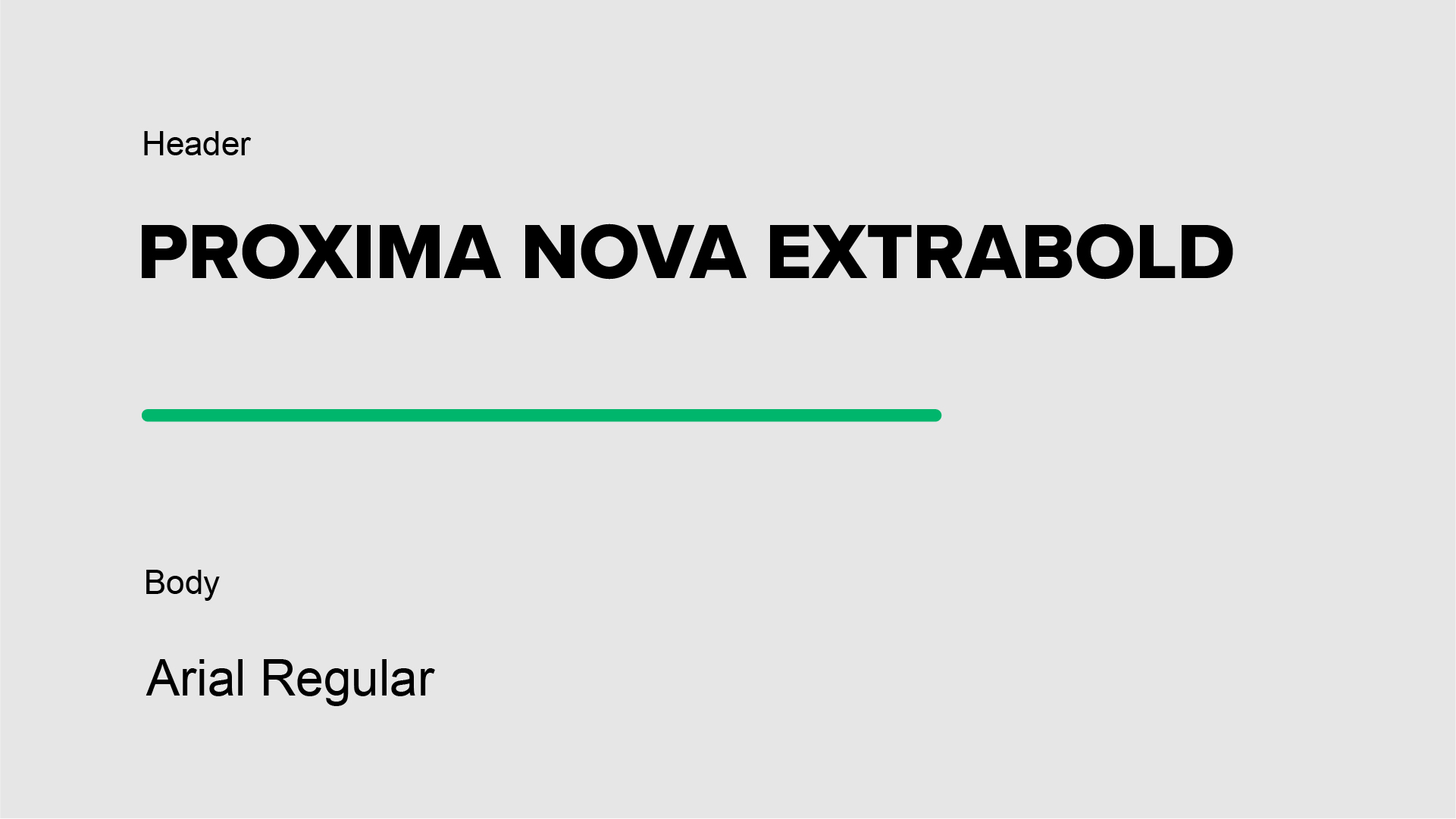
Proxima Nova Bold in all caps to communicate trust and institutional credibility, while Arial Regular was chosen for body copy to ensure clarity across the foundation’s text-heavy materials, including mission statement, statistics, and partner profiles.

Upon delivery of the final assets, Tyler also received a brand guideline to ensure consistent and correct usage across the foundation’s website, social platforms, and future materials.

The final brand identity reflects both the historical significance of Betsey Stockton and the foundation’s modern mission—establishing trust with donors while visually supporting a vision of growth, provision, and faithful stewardship.
Credits