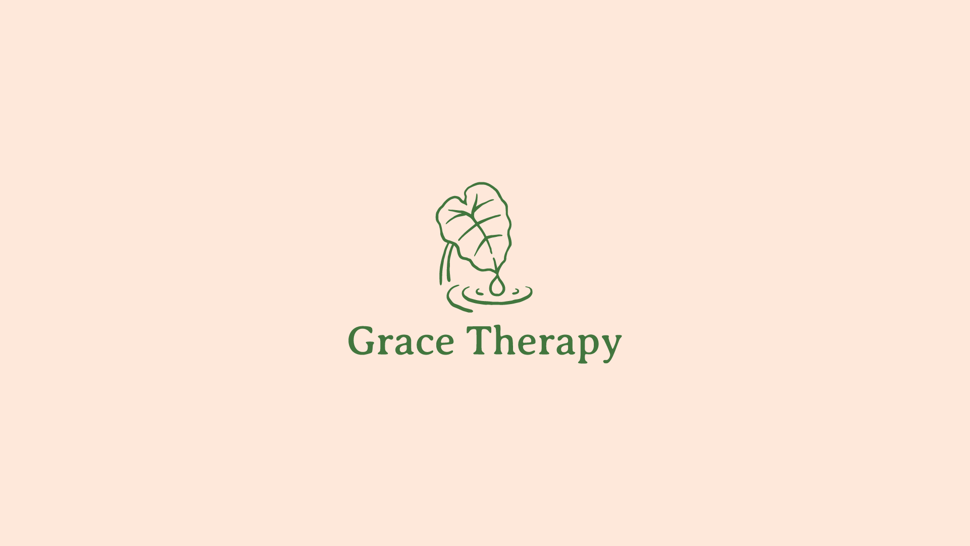
The final logo balances both leaf and water elements. The viewer’s eye is first drawn to the leaf, then guided downward to the water droplet, where ripples spread outward before leading the eye back up to the stem. This cyclical movement reflects the ongoing process of healing and growth.
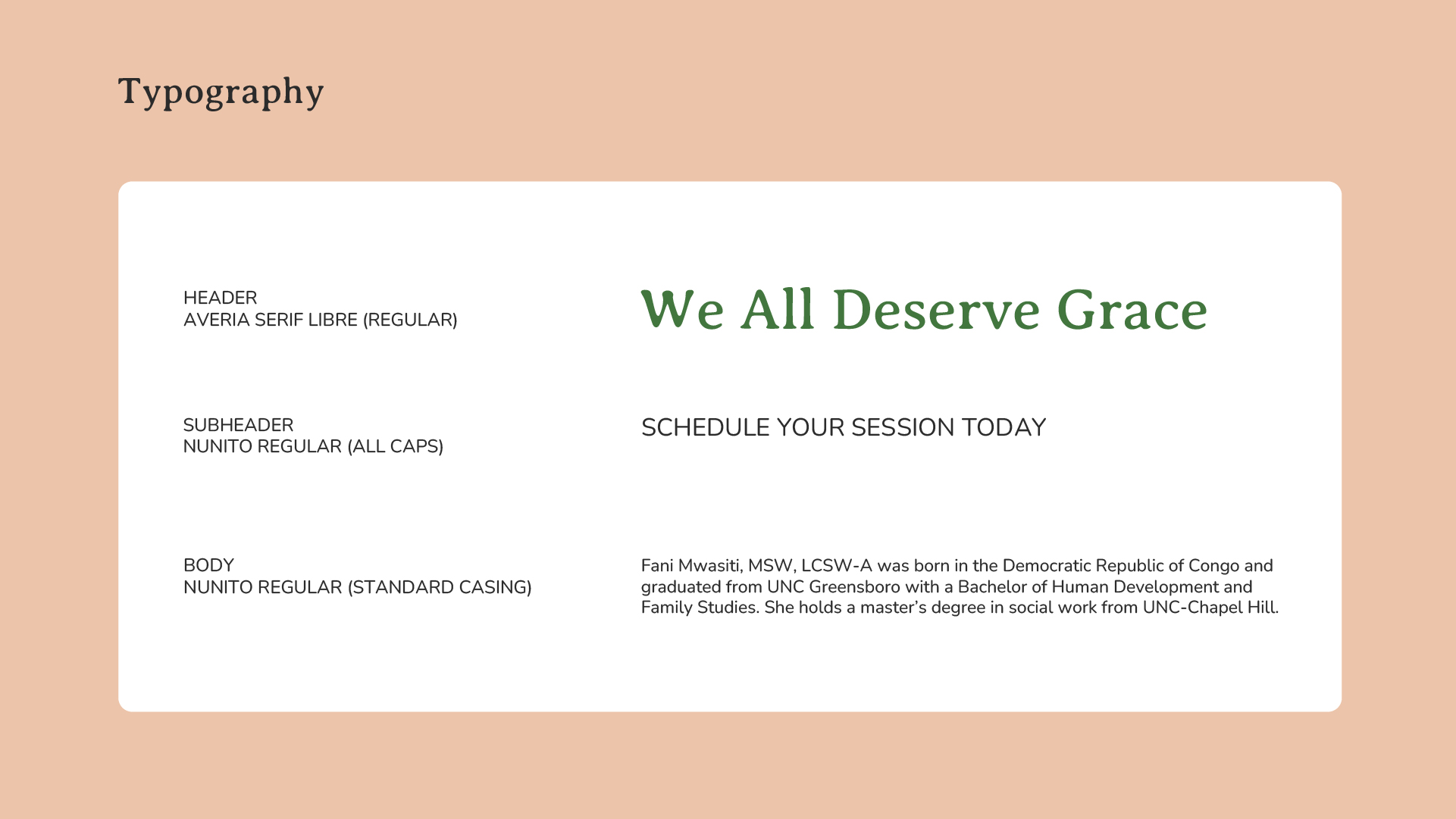
Typography was chosen to avoid harsh or rigid forms. A soft serif,
Averia Serif Libre, is used for headers, paired with
Nunito Regular, a sans serif typeface with subtly rounded extremities, for body text. Together, they reinforce approachability and warmth.
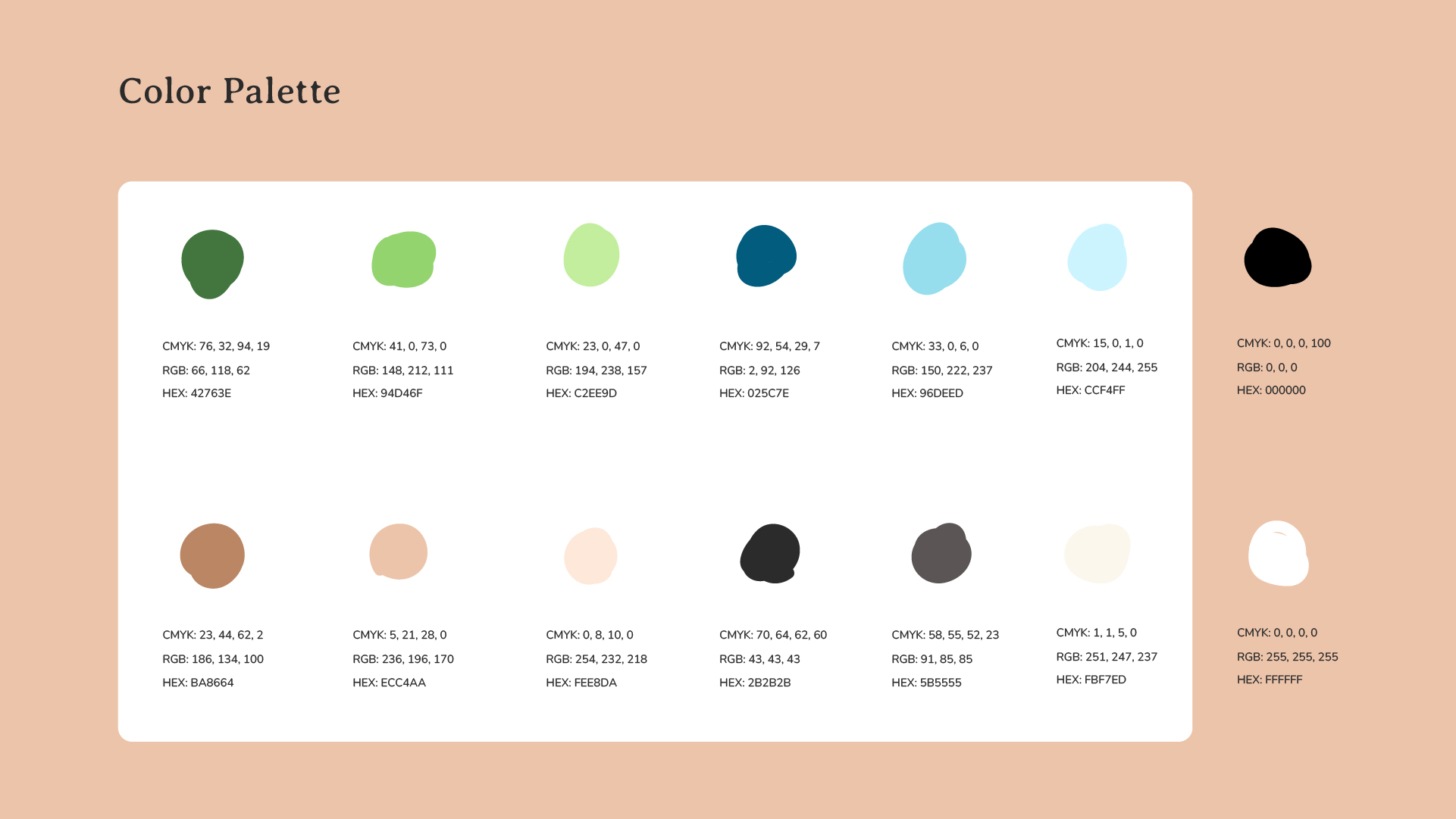
The color palette consists of various greens, blues, and neutrals. These colors reference nature, growth, and peace while also grounding the brand. Neutrals were intentionally included to suggest earthy roots; they also subtly acknowledge the diverse ethnic backgrounds of Grace Therapy’s patients. The primary colors are a deep green, off-black, and off-white, with pure black and white reserved for minimal use to maintain a softer, lower-contrast feel.
To ensure long-term consistency, I delivered a comprehensive brand book outlining proper usage of the logo, typography, colors, and assets. Fani has since implemented the brand across her website, social platforms, and email signature, confidently launching Grace Therapy with a visual identity that reflects both her values and her care for others.