Scope
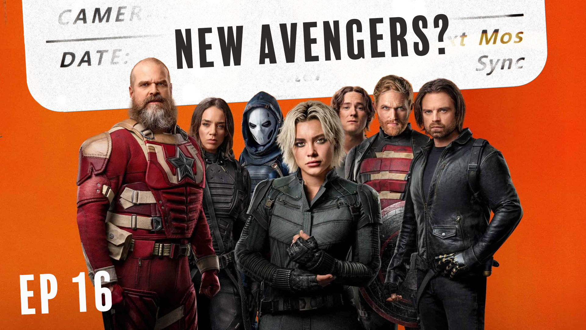
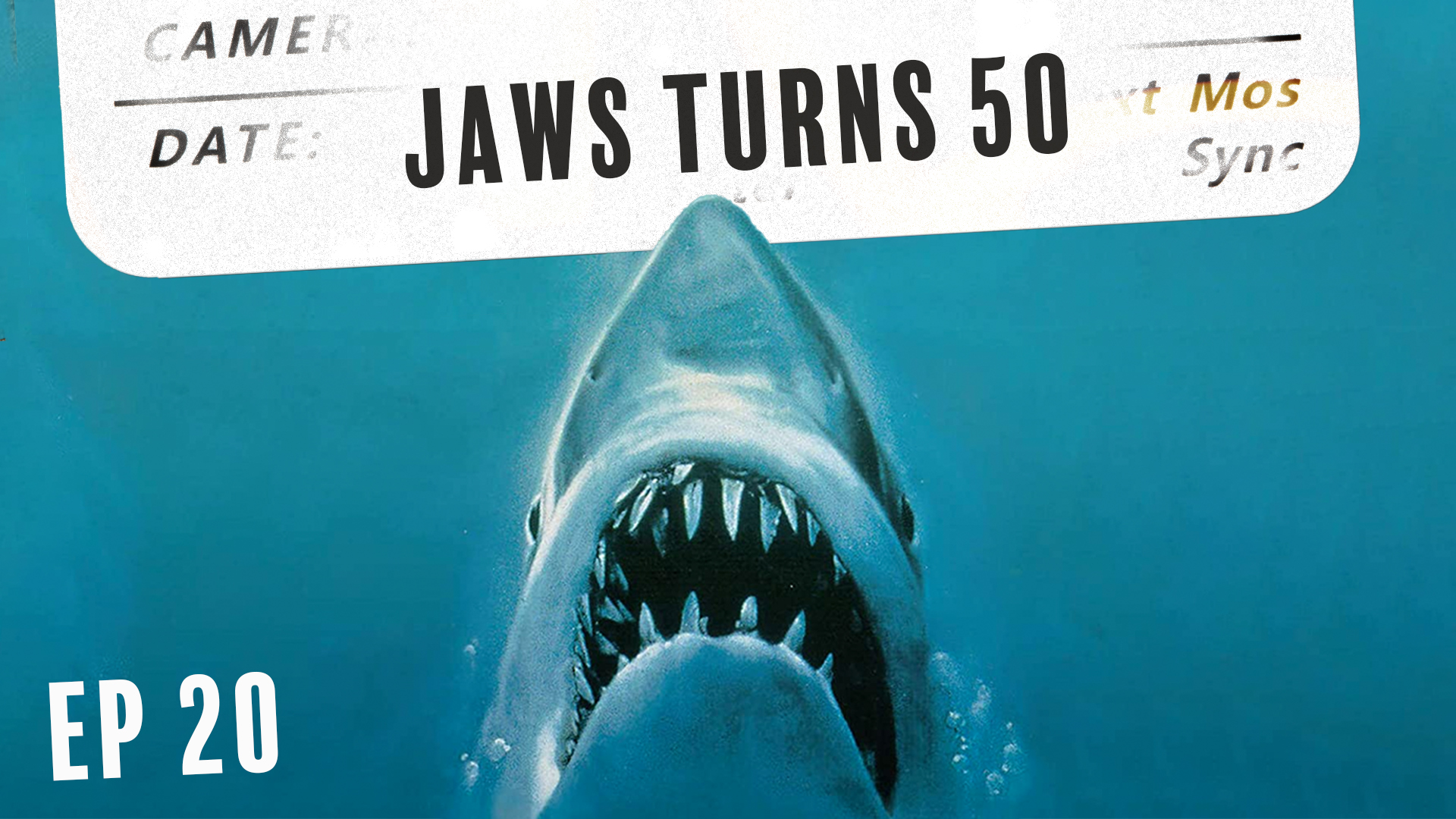
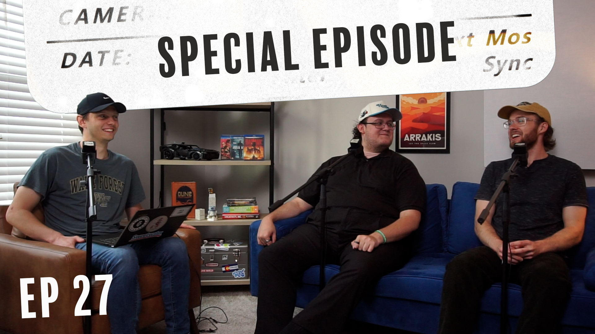
Creative & Art Direction
Graphic Design
Cover Art
Typography
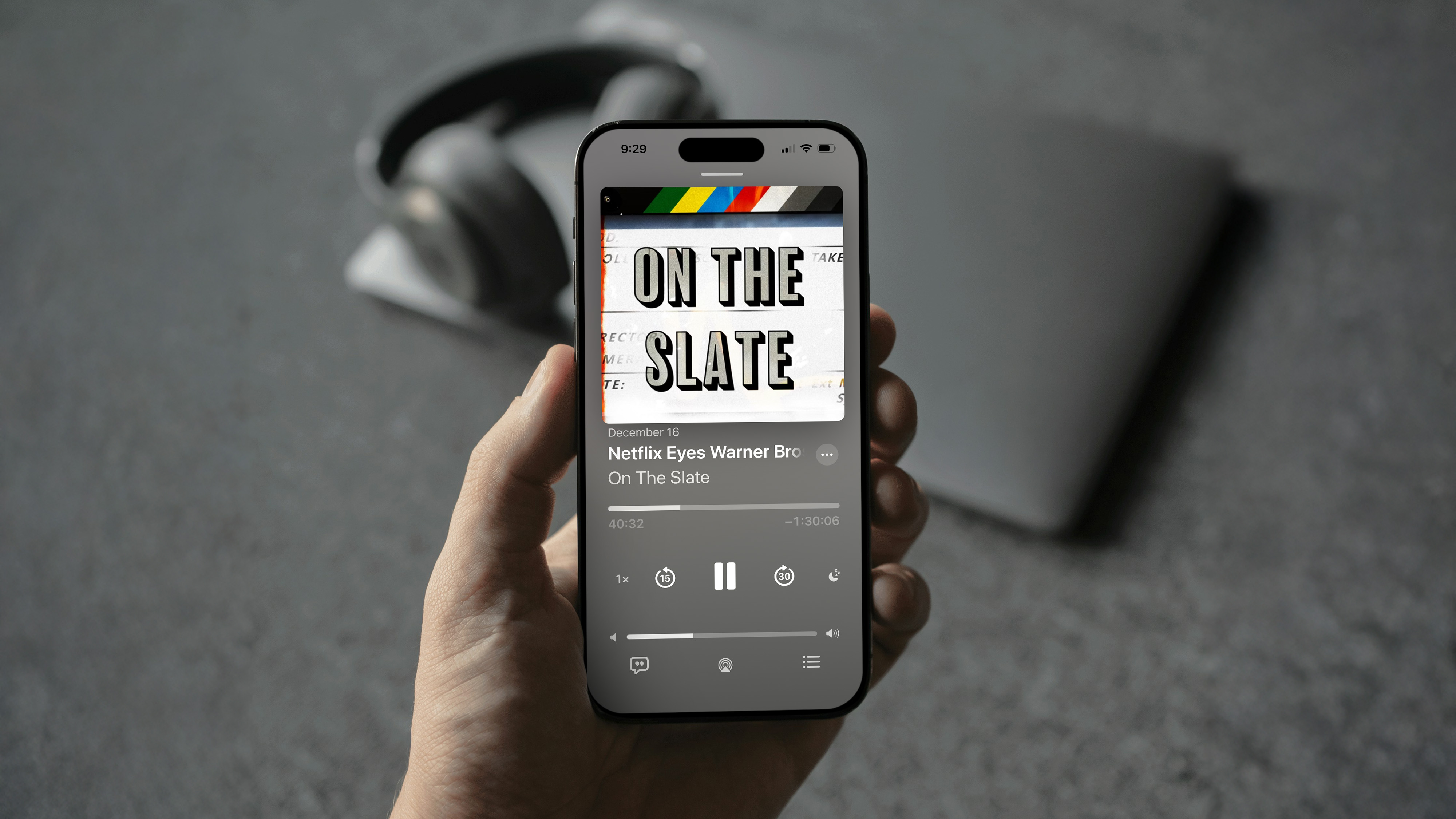
Talking about movies is a lot of fun—so much so that I started a podcast with two friends where we do exactly that.
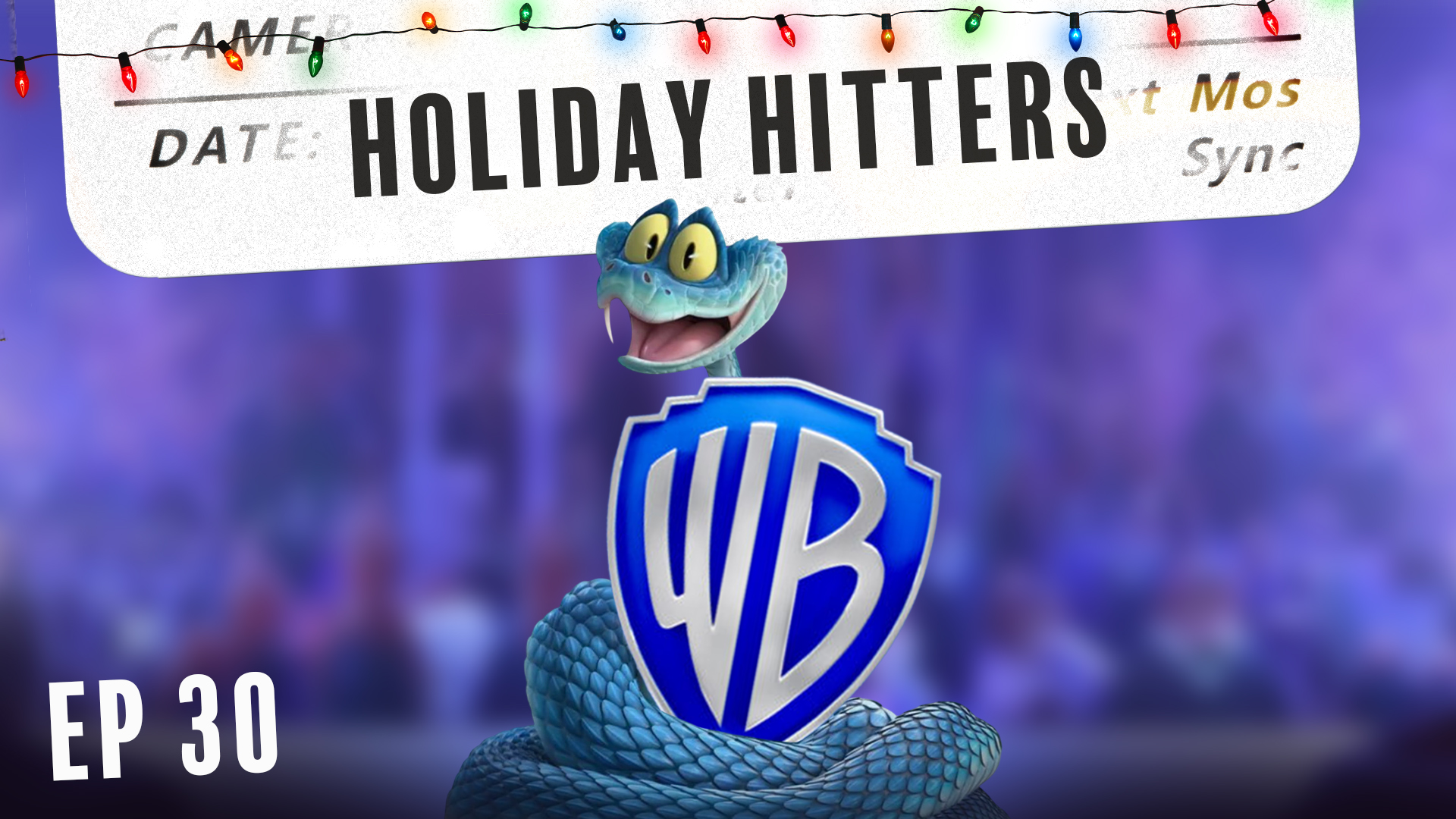
Once Wesley, Jason, and I landed on the name, I jumped straight into creating the official cover art. Since “slate” was literally in the title, I began with a photo I took of an actual film slate. I brought it into Photoshop and chose a bold, showy typeface that felt reminiscent of classic movie titles and even the famous Hollywood signage.
At first, the slate with the lettering alone felt too clean and sterile, so I began layering in photo assets from my personal library. The goal was to introduce grain, texture, film burns, and light leaks—elements that reflect the tactile qualities of filmmaking and make the image feel more tangible.